
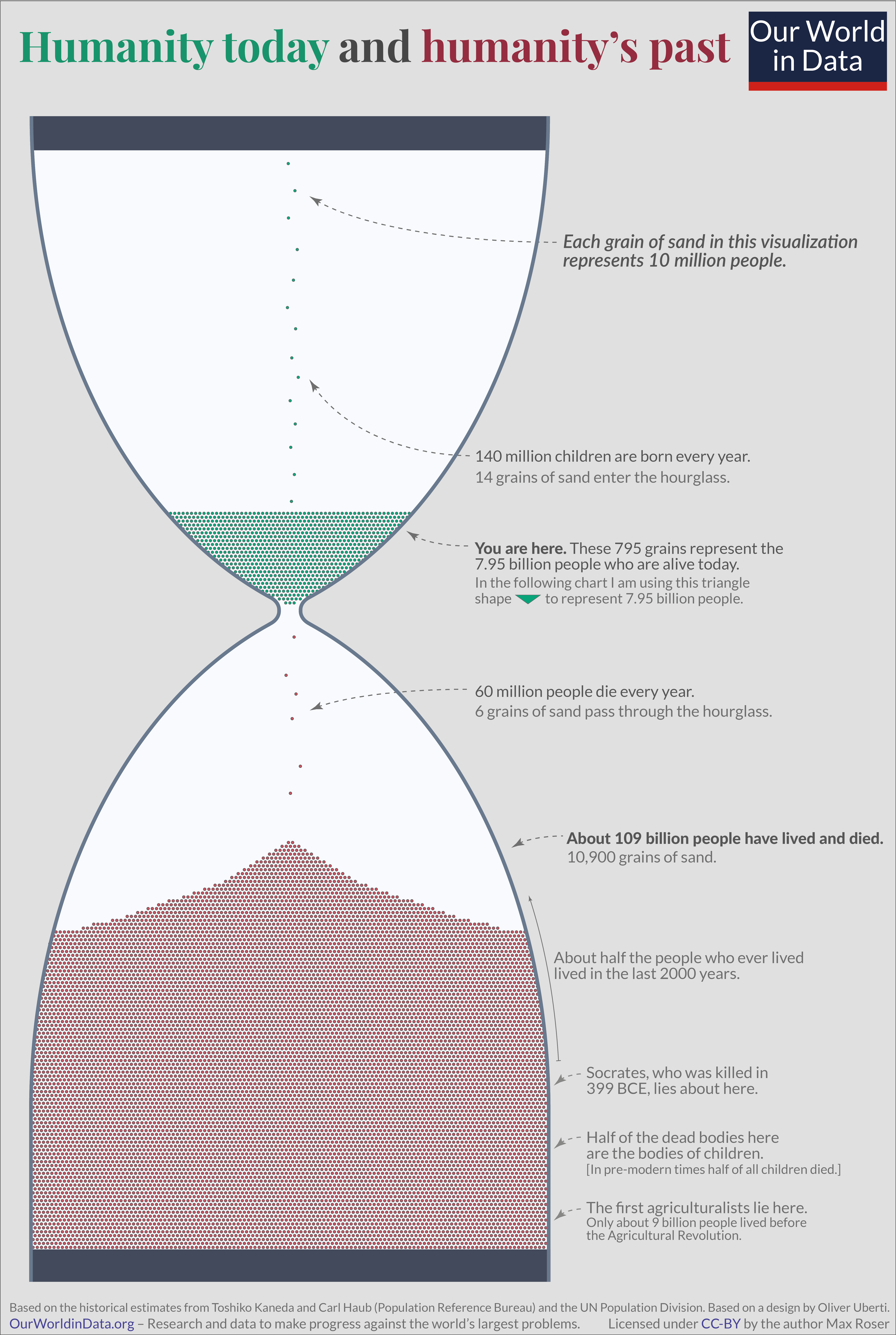
I chose this data visualization because it uses clear colors and language to get its point across, while still being visually appealing and interesting. This graphic also stood out to me as I sometimes have a hard time conceptualizing my lifespan, the length of the human race, and deep time, so this chart makes it slightly easier for me to comprehend.
https://images.squarespace-cdn.com/content/v1/5bfc8dbab40b9d7dd9054f41/45565a3a-33c3-4e30-9f82-98508d87d51c/Humanity+Visualized.jpg?format=2500w