
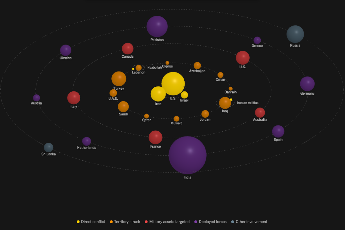
This data visualization identifies countries involved in the Iranian war and the extent of their involvement. The visualization, resembling a solar system, places the countries most directly involved in the center which are encircled by rings of lesser involved countries. In addition to their positioning, I like how each ring's color reiterates the extent of their involvement. I also appreciate the accurate inclusion of certain military groups and their country of operation as "moons" in the solar system.
*The size of spheres represents countries' population levels.
NYTimes