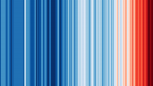
I was exposed to this climate change visualization in a data science class, and I found its clarity and simplicity very powerful. In an instant, you can immediately recognize what the colors mean, with little to no description. Furthermore, the graph communicates a very important and ominous message which sticks with me—as I imagine the author intended. While this visualization does require some context, I believe that the title alone communicates the message.